Every week, SNS publishes content on their website in the form of various articles, including editorials, interviews, and lookbooks. I was tasked with creating a new system and to make these three content types visualy cohesive. I also aimed to make it easier for users to find and buy the products shown in the pictures.
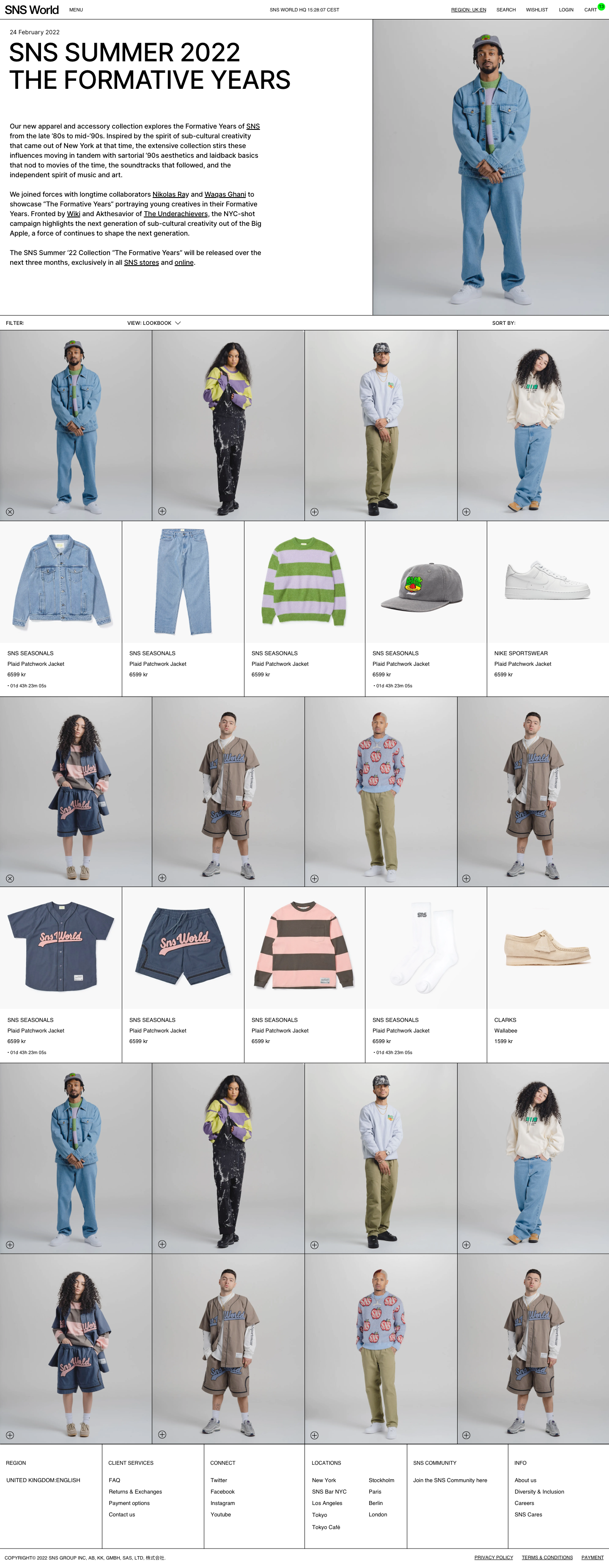
Lookbook
In the lookbook they want to give a good overview of all the pieces in the collection. The customer should be able to find the products of every outfit easily by clicking on the +.


Lookook with the products expanded.

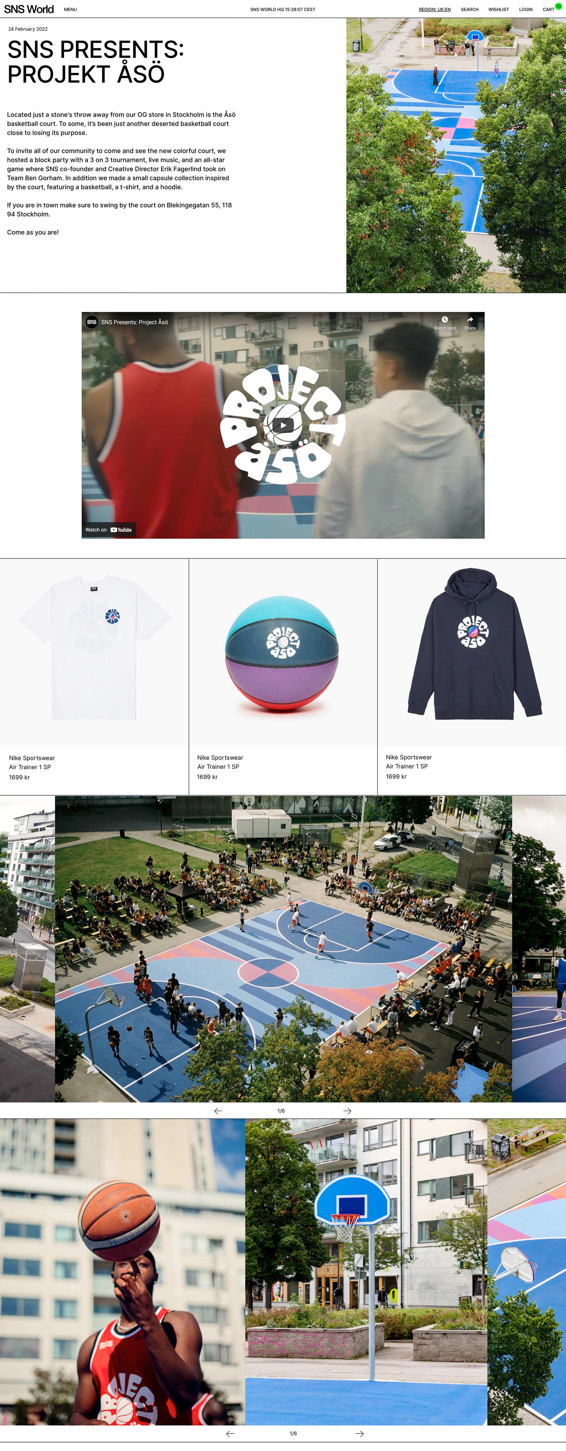
Interview
For the interview design, they had two wishes. They wanted to present texts in the best way possible so that more people would read them, as most people nowadays tend to avoid longer texts. They also wanted an editor to be able to put together content effortlessly. With that in mind, I designed different building blocks for text and pictures that could fit together in any combination.


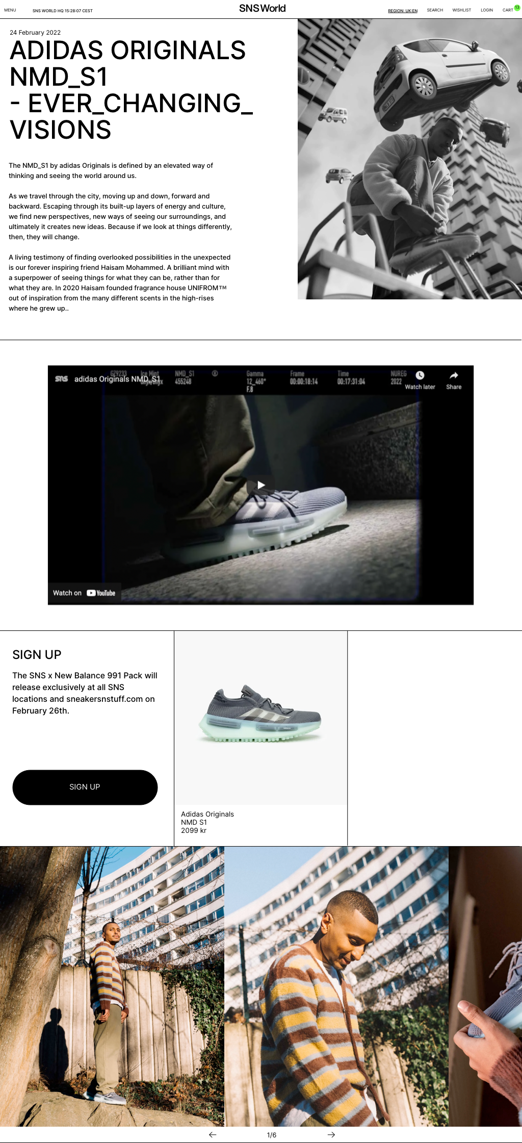
Editorial
In editorials they wanted to present images togheter with products in hope to convert sales. When a customer is intrested in something they click on the + and the product expands.


Building blocks overview
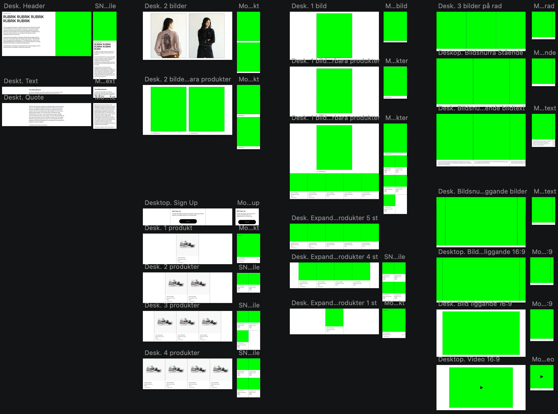
Examples of the building blocks in desktop and mobile.

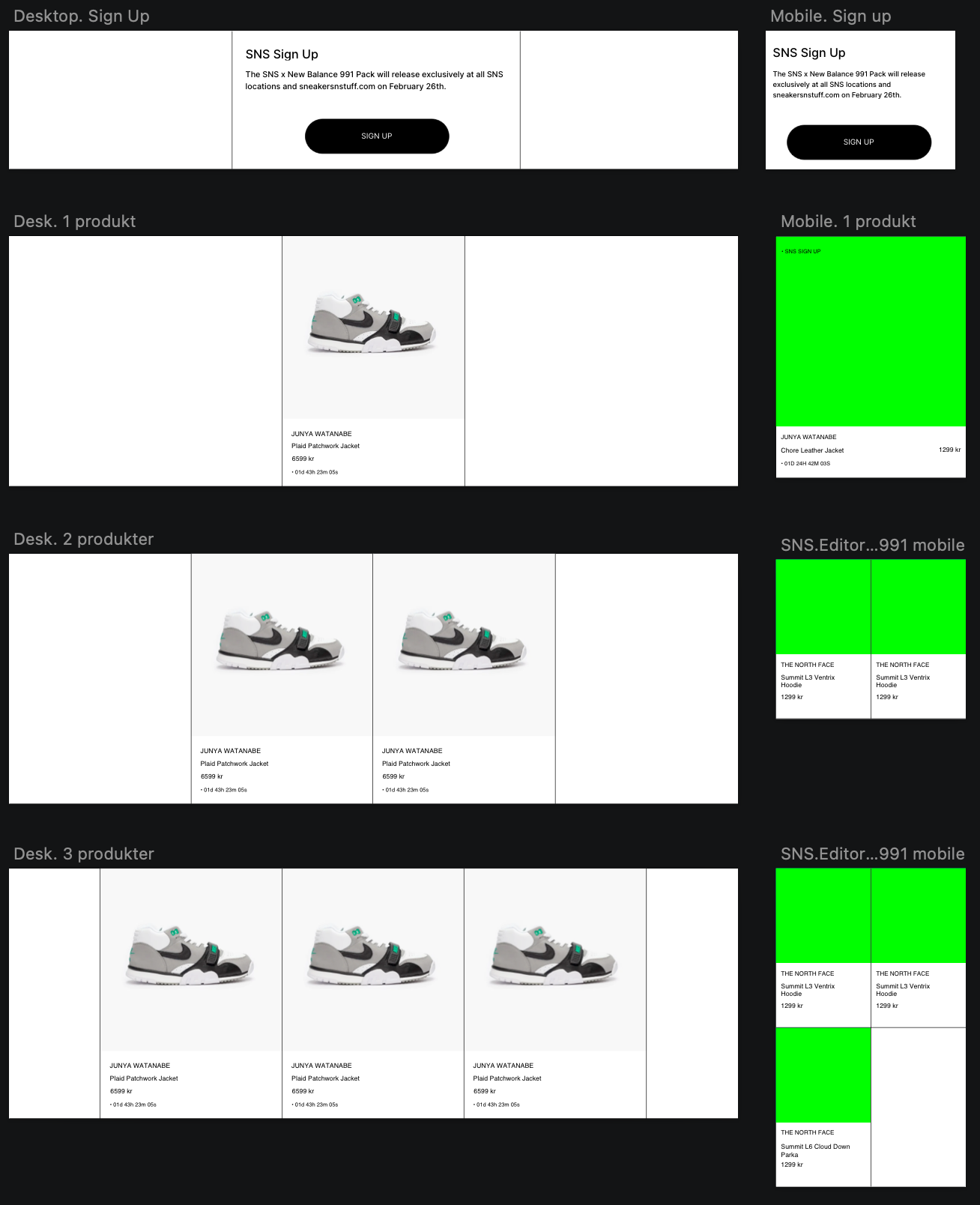

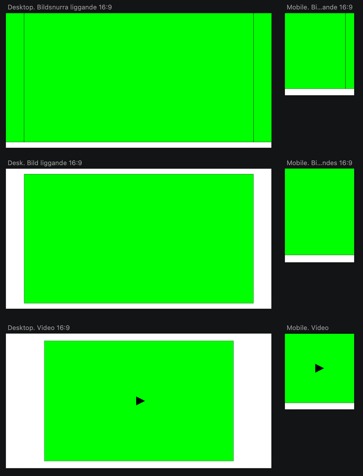
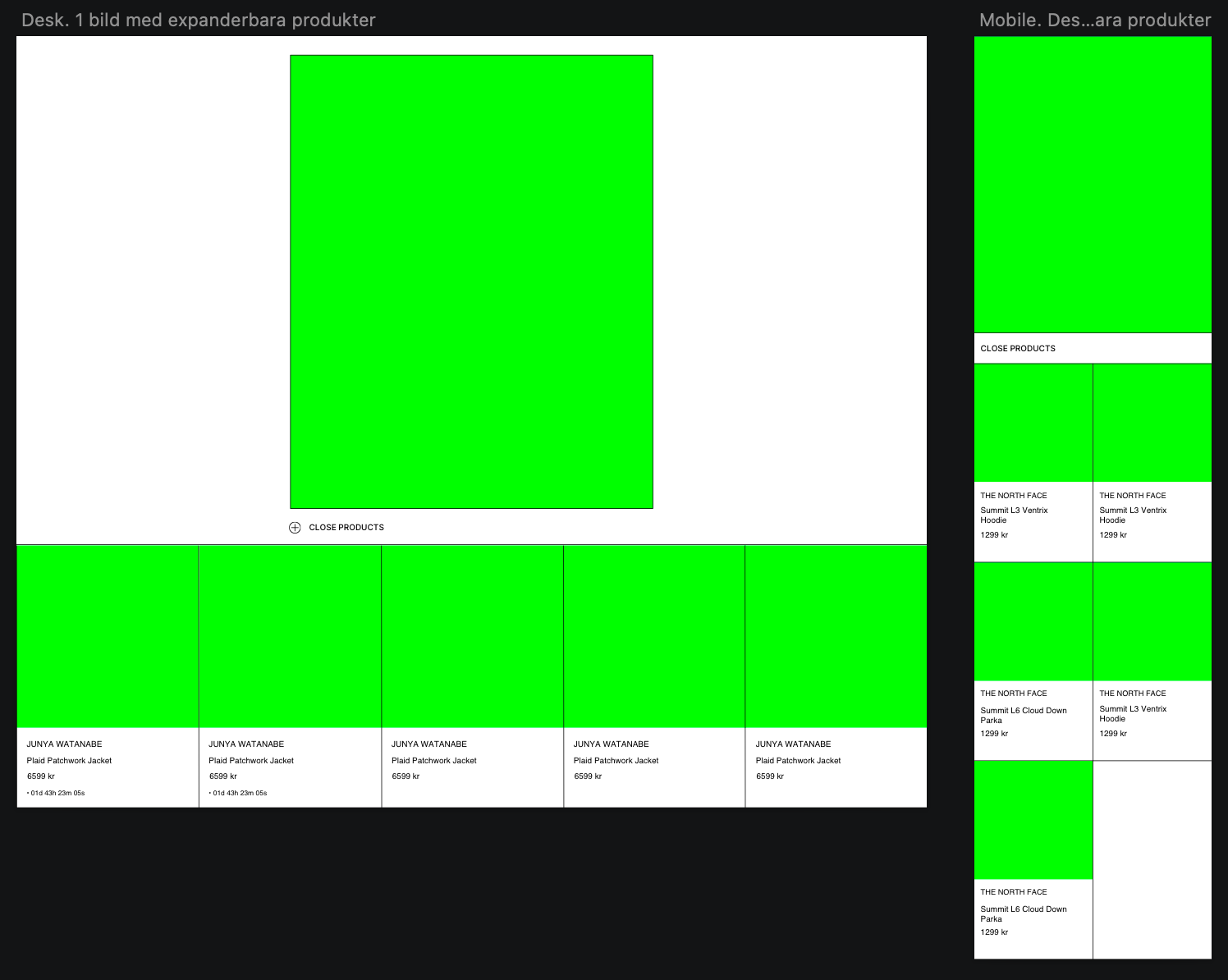
Images with and without expandable products.

