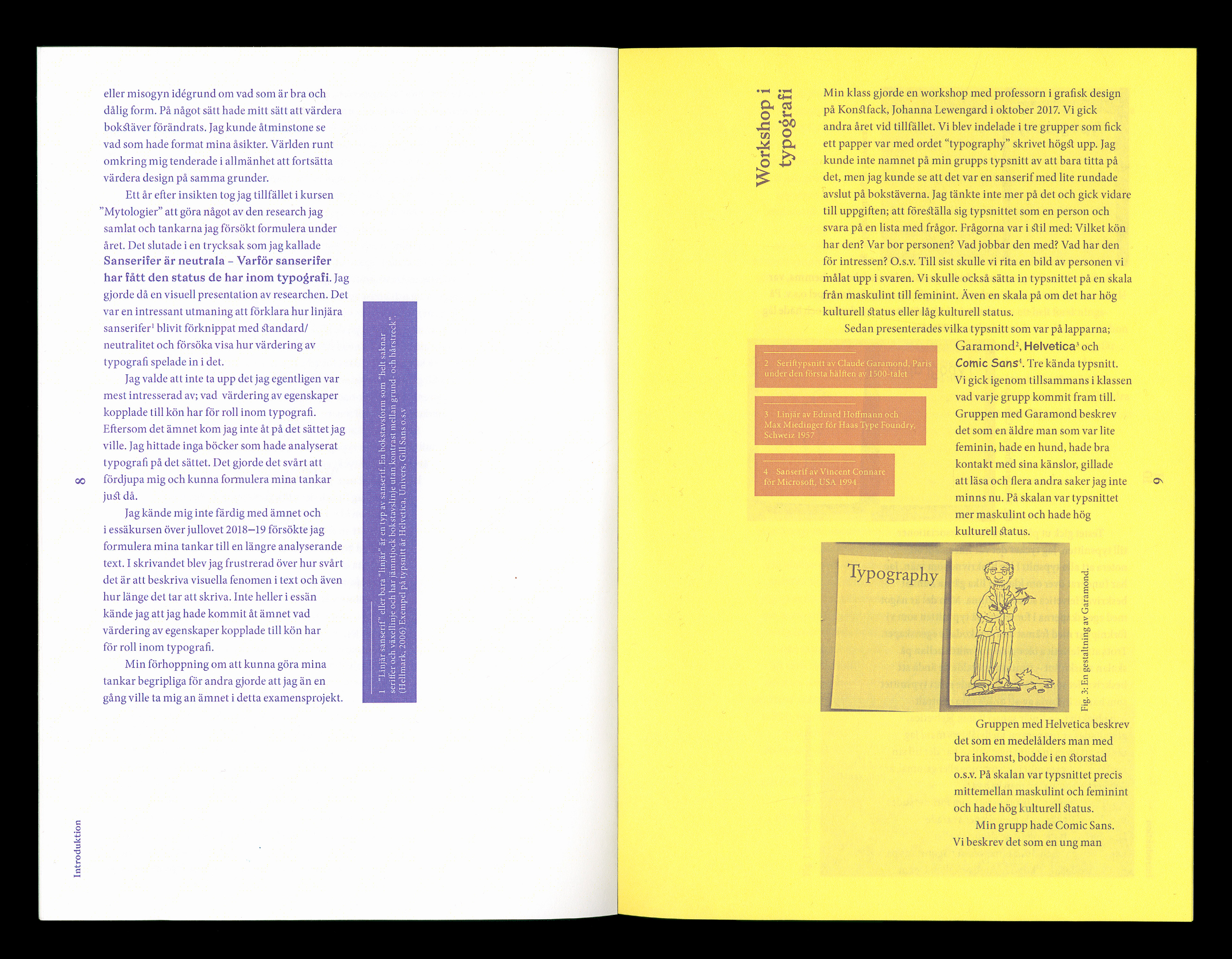
Typography is everywhere. It speaks to us and makes us understand the world. Why do we regard some typefaces as serious/professional and some as less serious? My BFA degree project is an investigation of the relation between the values of society and typography in the form of an essay and two publications. How do people read the design and the content in a text when you break the standards and rules of typography?
Book design | Graphic design | Essay writing

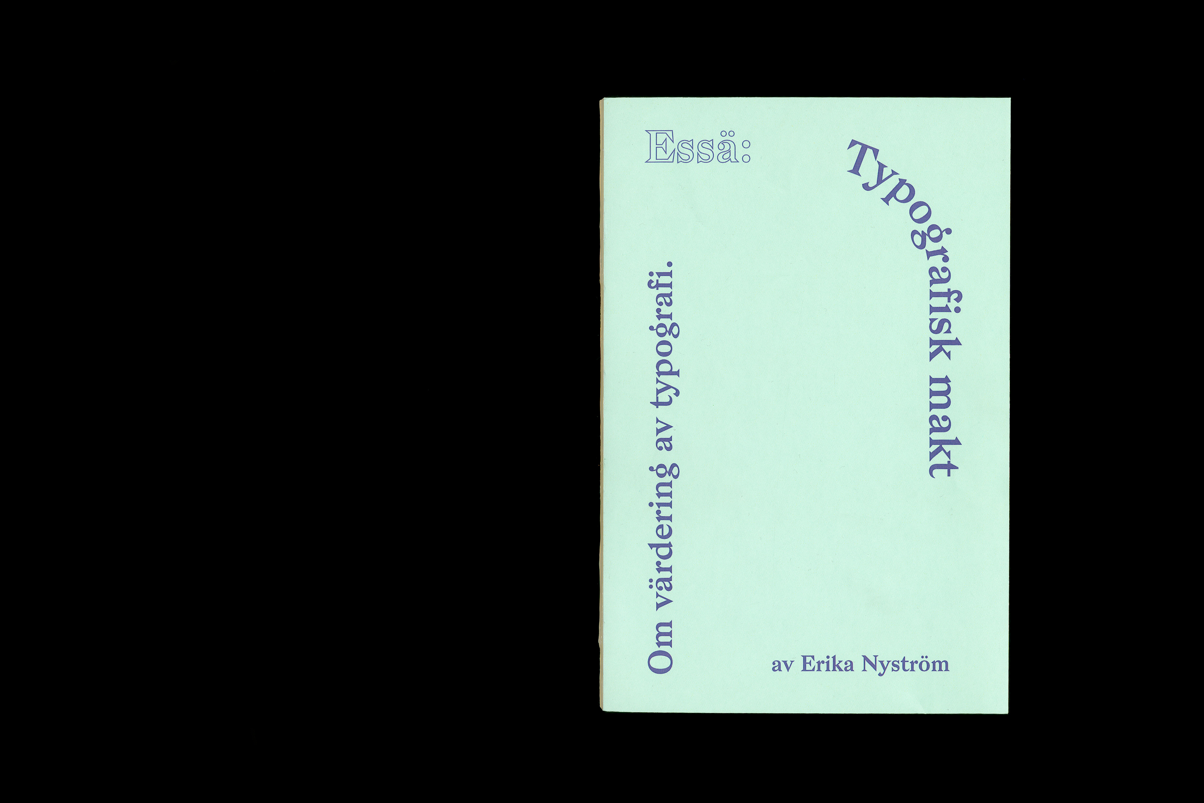
I made two publications with the same content (my essay) and chose two different ways of designing it to highlight that the content will be read differently by doing so and possibly also valued differently.
To the left is the one where I chose to break many of the norms of readability and functionality and the right I followed a more strict tradition always motivated by the saying "form follows function".

In this project I got a chance to really acquire knowledge and deep understanding about what in the history of typography that makes a typeface to be read as expressive or neutral. And what in a layout that makes the content to be read as professional and trustworthy in which situations.
Publication 1
"Breaking the Standards"
"Breaking the Standards"
50 pages, 160 x 240 mm


Publication 2
"Form follows function"
"Form follows function"
40 pages, 160 x 240 mm